Blog

Tips

Diving into a sea of letters

Recently I have been aiming to expand as well as deepen my graphics skills. I love to learn, and even if I might not get an opportunity to use these new skills professionally I still believe that they can influence in other areas as well. Inspiration might come from a source you would least expect.

A while ago I took part of a course in viral marketing, and I found some of the points to be applicable to graphics as well. One of the points mentioned was what makes a message memorable. This is something that is really important for viral marketing, but I would say that the same thing can be said about art. If you want to make a person feel something, I think it is safe to say that you want them to remember that feeling along with your art.

Another course that I took was the one that let me dive into a sea of letters. I have been fascinated how other people are able to express themselves with words, and not just by the words they pick but how they shape and place them. Even if I have created logos, menus and homepages, I have never really gone into the depths of the subject.

I usually looked through all the fonts in the software

Up until now I have been relying on my instinct and sense of design. I don’t think that is a bad thing per se. I got the job done, and I am happy with the results. However, when I look back I realize that it have been a bit time consuming. I usually looked through all the fonts in the software hoping to find something that looked good and made a good fit for the concept. Now, after having finished ”Introduction to Typoraphy” by California Institute of Arts. I feel that I have retrieved the knowledge to make desicions based on a more solid foundation of variables.

The course can be found at Coursera and it is free of charge unless you want feedback on the assignments and a certificate at the end. I do think that feedback is valuble but personaly I don’t care much for the certificate.  I will upload my results of the 3 assignments though, so feel free if you want to share some feedback.

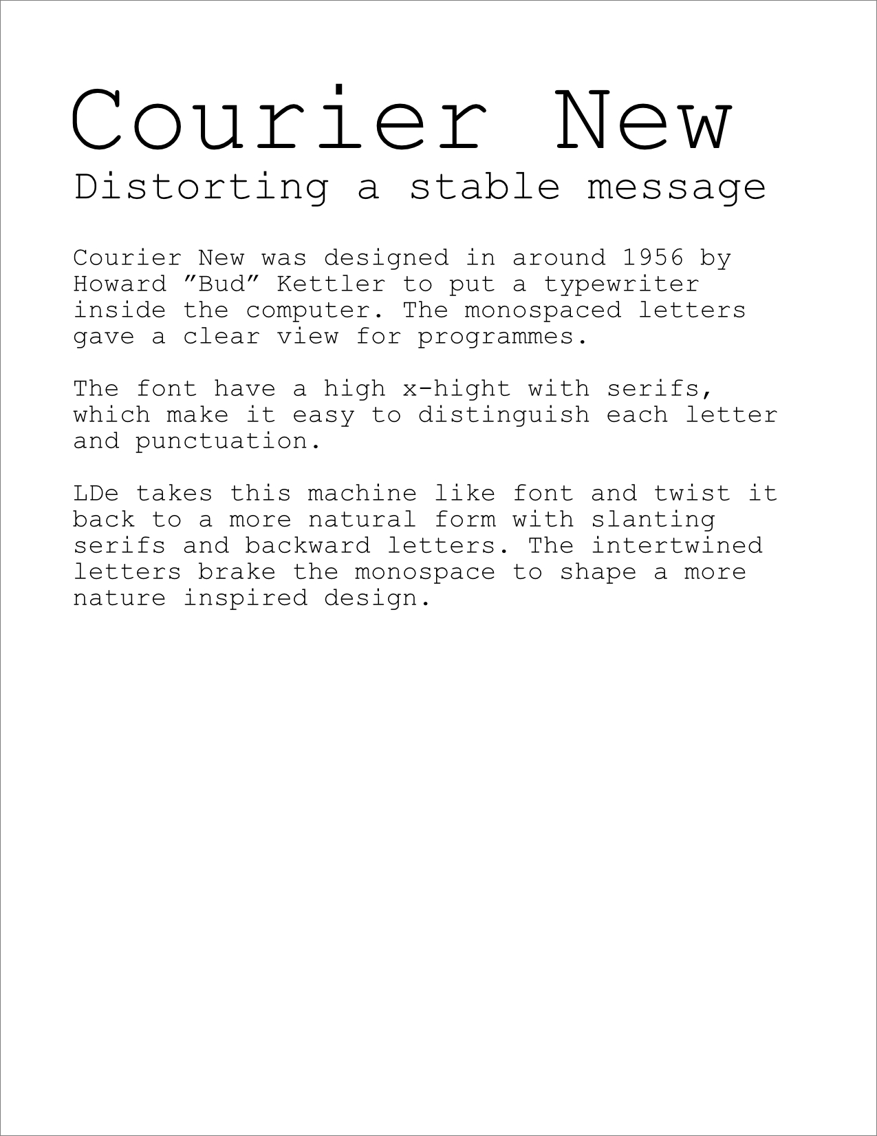
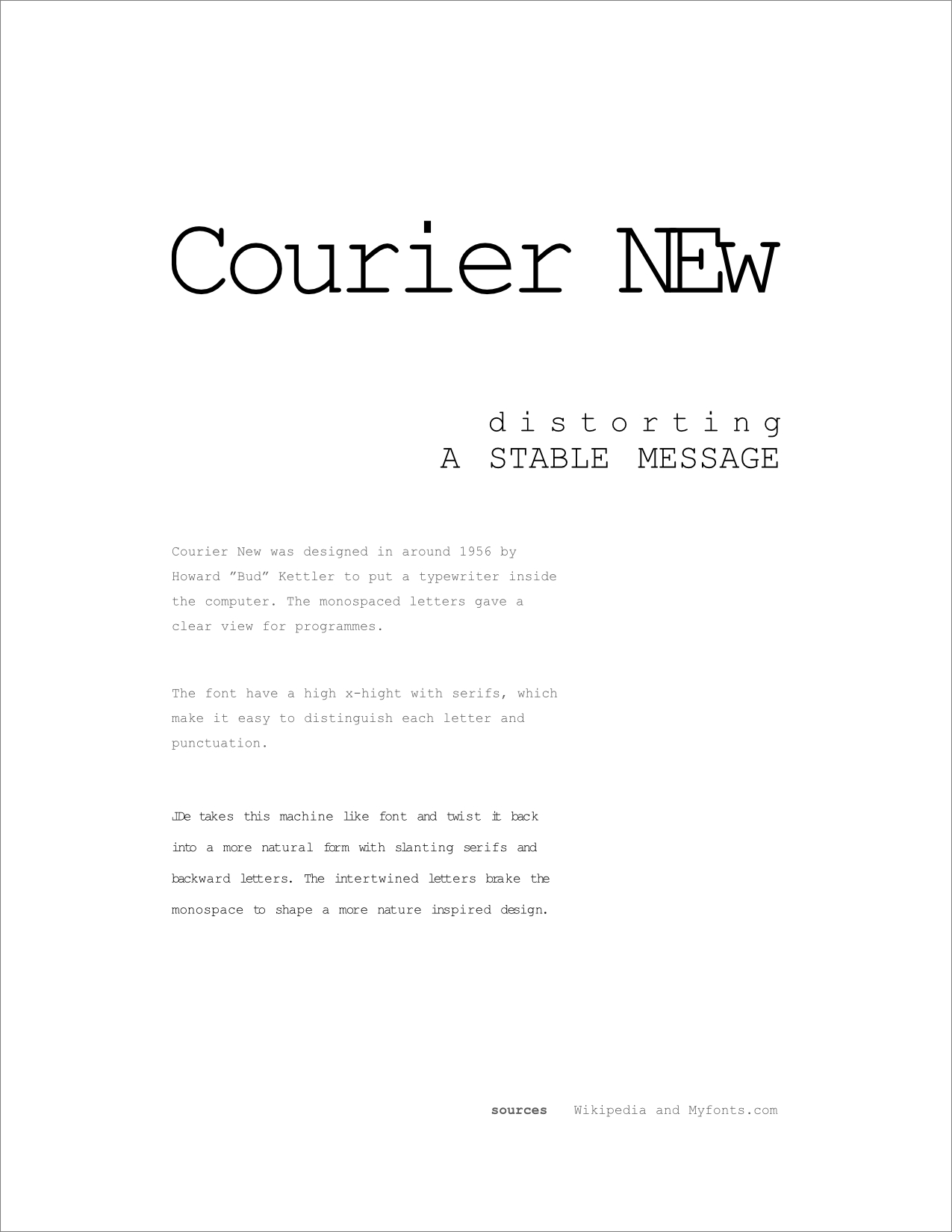
The first assignment was to simply research a font and write a short text about its history and characteristics. Since I am not handing in my assignments I decided to add another paragraph for how I decided to use the font when creating the logo for LDe.

The second assignment was to create an easy to read layout by deciding the width of the paragraphs and choosing font size and color. Then by modifying leading, spacing and by cutting the sentences where needed to create even rugged edges giving a less chaotic impression. Also, no two letter words were to be left hanging on the edge. As a last step the design was polished by creating a grid to help fine tuning the text and give a more solid impression.

the concept of the text was to be perceived by the design

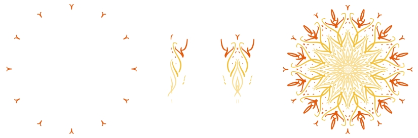
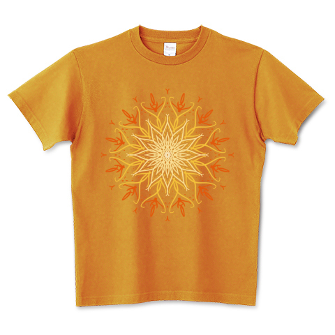
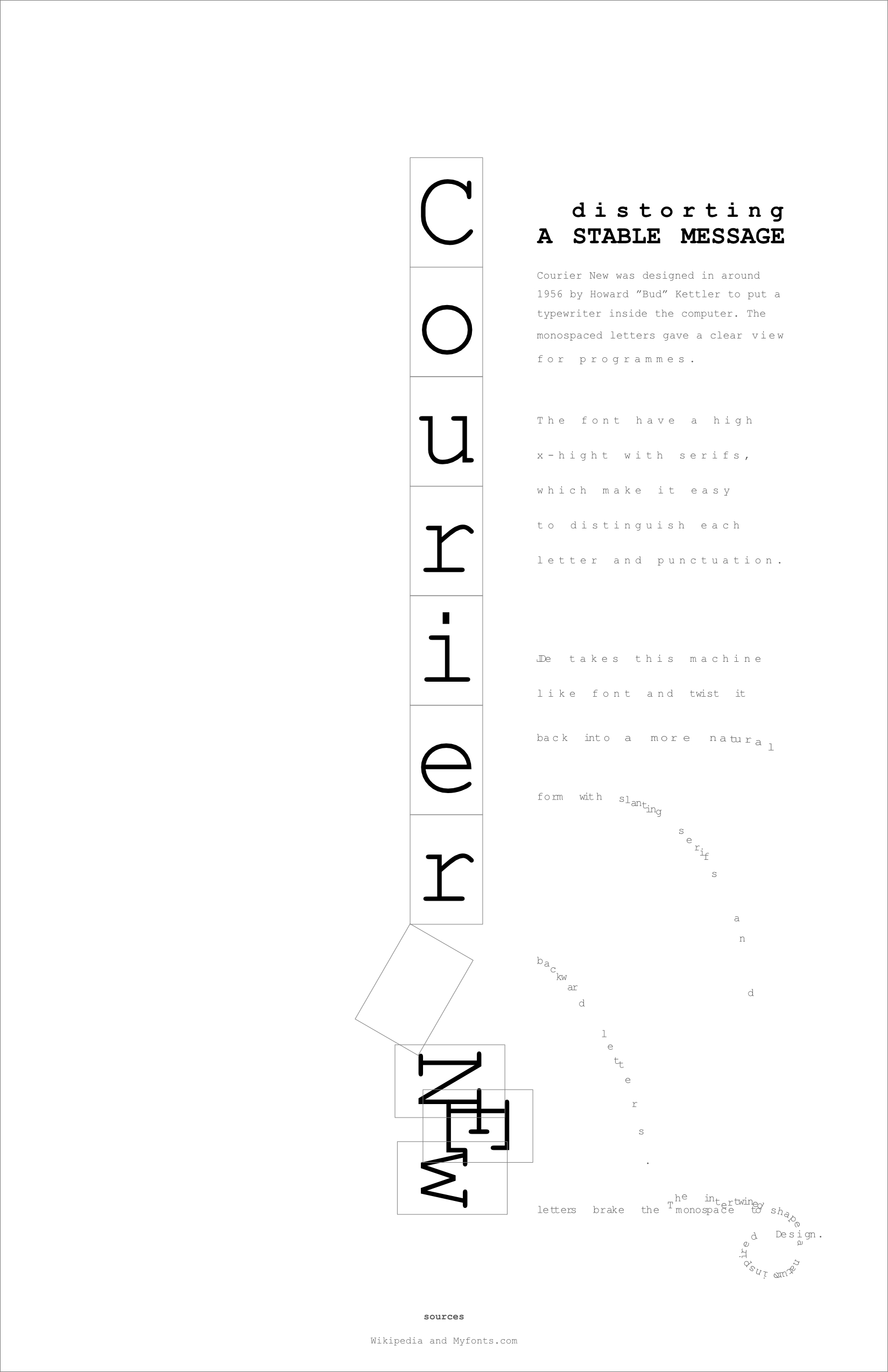
As the final assignment, a poster was to be created using the same text. This time, the concept of the text was to be perceived by the design as well as the actual text. In my case, I wanted to communicate the transformation from artificial to natural. I started by planning a base for the layout by analyzing the concept of the content. I wanted to give a strong first impression and build in the concept already in the title which is why it is placed in the middle, and the vertical alignment allows an even larger font size then if written horizontal. The vertical alignment also enhance the feeling of solid blocks far from natural. The last part that spells ”NEW” is used to communicate how the font have been modified as it is pulled down by the forces of nature giving it its new shape.

In the same way the sub header shows how the letters are pulled apart to reshape the original stable message. Finally the text in it self creates an animation like image where the letters are slowly breaking free from their decided place. It is a great fall and a time of uncertainty but in the end they land just to build something new and beautiful that only free minds can create.

Mandala how to
Tutorial

What is your mandala of the day?

Some of my last designs are mandalas. I really like those type of patterns. Even if they are simple and repetitive, they are totally mesmerizing. Can’t you just look at them forever?

When people used to draw these shapes by hand, they really had to think about the shape and how to draw it to be a true pattern. Now days it is much easier with software and applications that do most of the work for you. I have seen some people uploading mandala patterns made from photos, and I guess that it is done by using an app.

Some may call this cheating, but I would say it is still just a tool. You still need to do the input, and depending on the quality and the mind behind it, the end result will vary. Now the designers get to think more about the meaning behind the shape and colors instead of keeping the lines the same.

Personally I use Affinity Design to create my designs. I like using Procreate as well, but raster graphics doesn’t go well with t-shirt printing as good as vector graphics. Especially when it is printed with a white background and not using a blending mode. If there are any transparency, it wont look very good. Anyway, Affinity Designer allows you to create symbols that you can place out as many times you like. If you place them well they will produce a mandala as you draw inside of one of them.

Each node of the mandala is created by placing two symbols whereas one of them is reversed. This creates symmetric shapes where you only draws one side. The grouped symbols are copied and rotated around the same center point until the circle is completed. Then you can start to draw for real with instant feedback of the end result.

Mandala how to
Each node of the mandala is created by placing two symbols whereas one of them is reversed. Copy and rotate the grouped symbols around the same center point until the circle is completed.

My latest mandala designs represent ice and fire, two elements that I love. Ice landscapes can be absolutely breathtaking by its different shapes and constantly shifting colors, same as the flares of a fire in constant motion flying into the sky. I can’t wait to design more in a similar fashion. I am thinking of doing one inspired by the forest but I am always up for suggestions with thoughts about what inspires you.

ttrinity shop
Feature

Free platform for printing and distribution

So far this blog have been in Japanese, but I realize that I wanted to expand the business and spread my designs to the rest of the world as well. Therefore, I will from here on write in English for this blog as well!

Anyway, this post will be about my platform for distribution, since I had some of the first products delivered a while ago. I’ve got photos of them all but I will talk about the products in another post so stay tuned for more blog posts or visit my instagram for the rest.

I have always wanted to start a T-shirt shop but there are a lot more to it then just design. The designs needs to be printed on products and usually you buy a lot of them and hope that you are able to sell them. It is a great risk and it requires a lot of money. Not all of us are able to take this risk, and I am one of them. Luckily, platforms that can help you with these problems are increasing.

I am currently using ttrinity as my platform for distribution. It is completely free, and you get the difference from the price you set and the base price in your pocket for each sold item. They have a really good design tool that can be used on hand held devices as well. A great plus since I am using an iPad Pro for my design work.

ttrinity shop

Ttrinity lets you set up your own personal shop page with your own header and links to your collections and profile page.

The collection function lets you categorize your designs so that they are easy to find for your customers, and you can add new items to them continuously. Since I tend to use different styles, it is nice to be able show the each collection by itself for a better impression.

The profile page is a good way to let your audience know what your shop and designs are all about. It also lets you set up links for your Instagram and Facebook page.

there are some downsides for new designers

I was very excited to start use ttrinity for selling my designs, however there are some downsides for new designers. One of the positive things with the platform is that all new designs are put in a common store as ttrinitys start page. I great way to find new customers you would think, but there is also a grading system. Ungraded items don’t show up in a regular search or the new design list. The employees are probably doing their best to grade the designs and usually it takes a day if it is a weekday. But by that time your design is already on the third page or more which is rarely seen by the common customer. You would think that the rating is done in order but it seems like some stores are prioritized over others. Unless your store is prioritized, you won’t get a second on the first page.

the quality of the print and product are good

After getting my first delivery of products, I can say that the quality of the print and product are good, but unless you have a stable fan group on Instagram or Facebook, you might want to start getting one if you are to use this platform.

BBQ header
Photo

キャンプダンサー

この間「LDe」以外の別プロジェクトのTシャツをバーベキューしながら、撮影してみました。私は写真の撮影に対して、割とベギナーなんですが、とても楽しかったです!

これからも「LDe」のTシャツも撮影したいので、勉強になりました。最後の方は暗くなってクオリティが下がってしまいましたが、夕方ならスマホでも中々良い写真が取られたと思います。

写真に見えるTシャツはキャンプダンサーと言うオリジナルデザインです。

Living on the edge header
New item

パグはちょっとだけ怖い

グランジ動物の種類が増えました!今はベンガルだけじゃなく、パグのデザインも有ります。大きな目で性格良く伝えます。

今回、パグは「Living on the edge」の表現を伝えてくれます。怖いと思っても、逃げずにアドベンチャーのようにチャレンジします。

以下の色以外も他の色ありますので、ウェブショップにプリントの白バージョン黒バージョンを観に行ってください。

Polar bears header
New item

これから早めに泳げるようにならないと

今住んでる場所は住めなくなったら引っ越せばいいと思いますか?でもシロクマの場合それは出来ません。なぜなら地球の氷は溶けてしまっているから。

シロクマの事を全く心配しない人もいるかもしれませんが、地球は一つしかない。人々が変わらなければ、私達も逃げ場を失います。

現在、シロクマは地球温暖化のシンボルとなっていますが、温暖化は地球の全ての生き物に影響します。みなさんで今行動しないといけません。

出来る限り一緒に地球を守りましょう!

「Polar bears」と言うデザインはウェブショップにいます。

Pineapple demon header
New item

Pineapple Demon (新アイテム)

パイアップル化け物のテーマで「simple ‘n CUTE」コレクションの新デザインを作成しました。

「lisaDESIGN」は始まったばっかりの時にワクワク過ぎて眠れませんでした。その時にこのアイデアが現れました。それで以下のメモを描いておきました。

昨日上のイラストを完成し、ウェブショップに追加しました。今回はTシャツだけじゃなくてバッグとスマホケースも作ってみました。

色の種類はたくさんありますのでよかったらウェブショップに観に行ってください。

Collections header
New collection

新コレクション

前回のポストに「グランジ動物」を紹介しましたが、今のところにまた3つのコレクションがあります。今回はその3つを紹介したいと思います。

まずは「エコ」というコレクションです。シンプルな表現でエコと環境問題のメッセージを伝いたいです。一緒に自然を守りましょう!

「simple ‘n CUTE」もシンプルなんですが、このコレクションはもっと柔らかい形のかわいいデザインです。

最後は「マンダラ」コレクションです。一般的なマンダラじゃないと思いますが、デザインのイメージと雰囲気はマンダラです。

これからも上のコレクションのアイテムが増えのでたまにウェブショップを観に行ってください!